Anyone running an account for a brand keeps a folder of near-identical exports: the square one, the round-cropped one, the wide one for the channel banner, the tall one for stories, the small one that the link preview uses. They drift. Someone updates the square version and forgets the banner, and six months later two versions of the logo are in circulation.
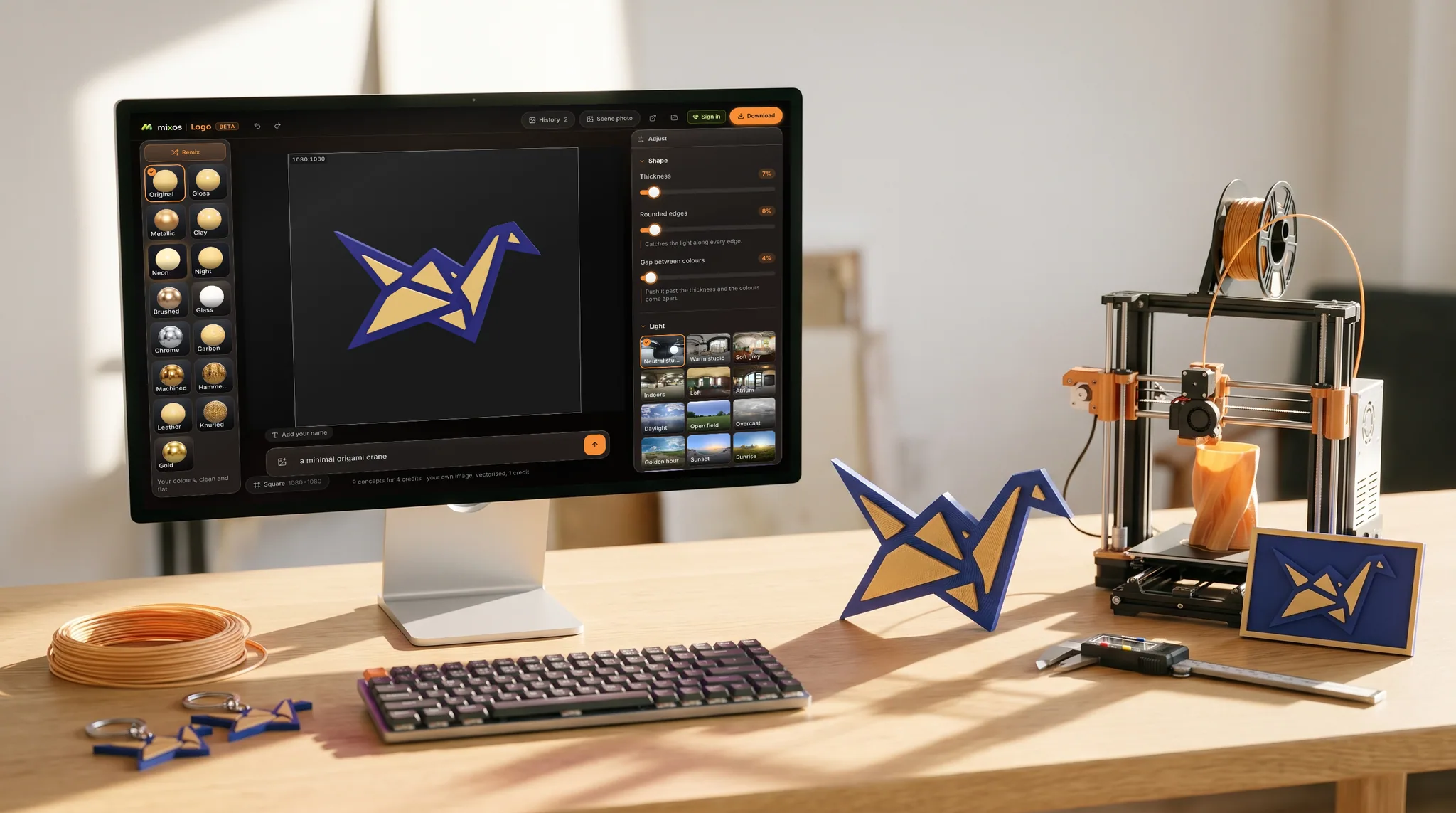
Building the mark as a 3D object rather than a set of flat files fixes the drift, because there is one thing and the sizes are views of it. Change the colour or the finish and every size you export afterwards carries the change.
It also helps with the specific problem of being small. A profile picture is rendered at a few dozen pixels in a feed, and flat marks with fine detail turn to mush there. Real depth gives a silhouette: a raised layer with a bevelled edge catching a light has an edge the eye can find even when the detail is gone. It is worth zooming out while you set the thickness, because the version that looks best large is rarely the one that survives small.
For video, the transparent clip is the useful one. A two-second spin over the opening frame of a reel, or a slow sway looping in the corner of a stream, does the job that a static watermark cannot — and because the background can be switched off entirely, it goes over footage without a black rectangle.