The standard chrome logo is a layer style: a steep gray gradient, a white line near the top, a darker band underneath, maybe a slight bevel. It reads as chrome at a glance and stops reading as chrome the moment anything moves, because a real metal surface does not have a fixed pattern painted on it — it shows whatever is around it, and that changes with every degree of rotation.
The version that holds up needs three things a flat file cannot provide: a solid surface with real curvature at the edges, a description of how that surface scatters light, and an environment for it to reflect. Once those exist, the highlights are not drawn, they are the consequence of where the object is standing.
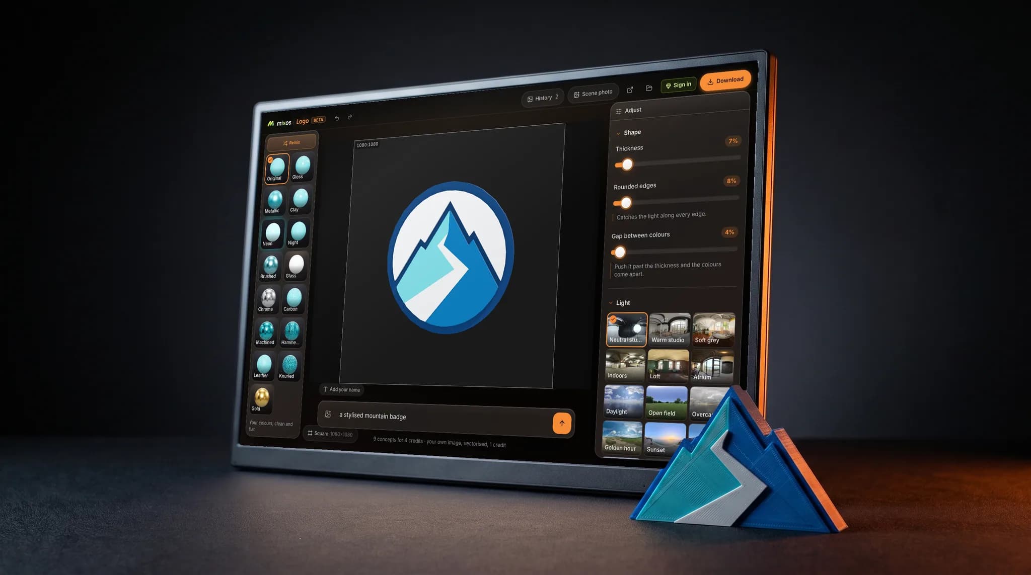
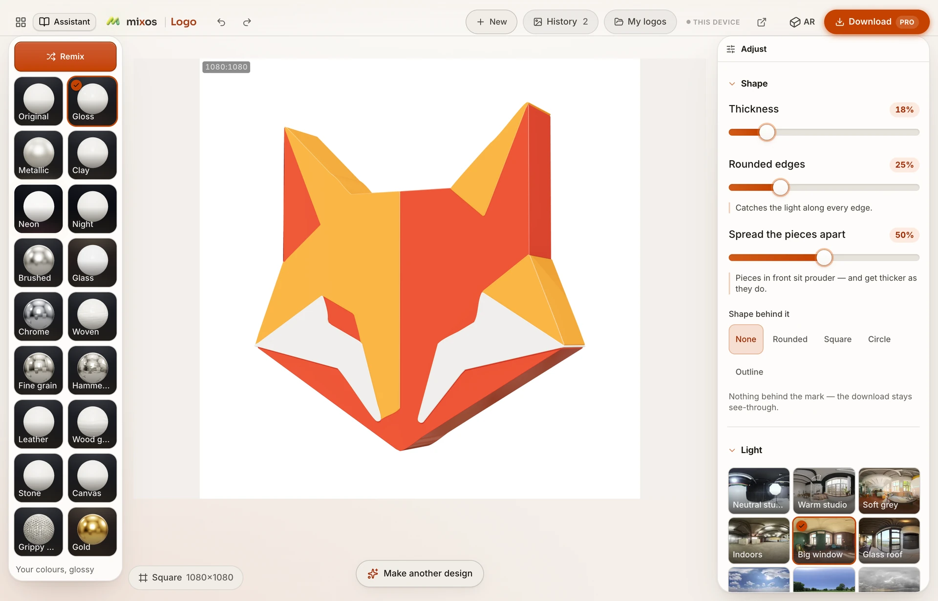
That is what is happening here. The mark is raised into pieces with bevelled rims, given a metal surface, and placed in a lighting environment you choose. Switch from the neutral studio to a city at night and the same gold mark goes from a clean product shot to something lit by windows. Move the shine and the highlight walks across the bevel.
It is worth knowing when not to use it. A metal finish throws away your brand colors, which is fine for a title card or a badge and wrong for the logo in your email signature. The eleven non-metal finishes exist for that case, and a brushed metal is often the compromise: it reads as metal without the full mirror.