The classic spinning logo is a flat image rotated in a video editor, and it gives itself away at the quarter turn, when the whole thing narrows to a line and vanishes. Some tools hide this by fading out and back, or by never turning past about forty degrees. Both are working around the same missing thing: there is no object, so there is nothing to see from the side.
The fix is not a better animation curve, it is depth. Once each flat color is its own raised piece, the mark has real edges, and edges are what a rotation is for. The silhouette changes as it turns, the light moves across the bevels, and the eye reads it as a solid thing rather than a picture being tilted.
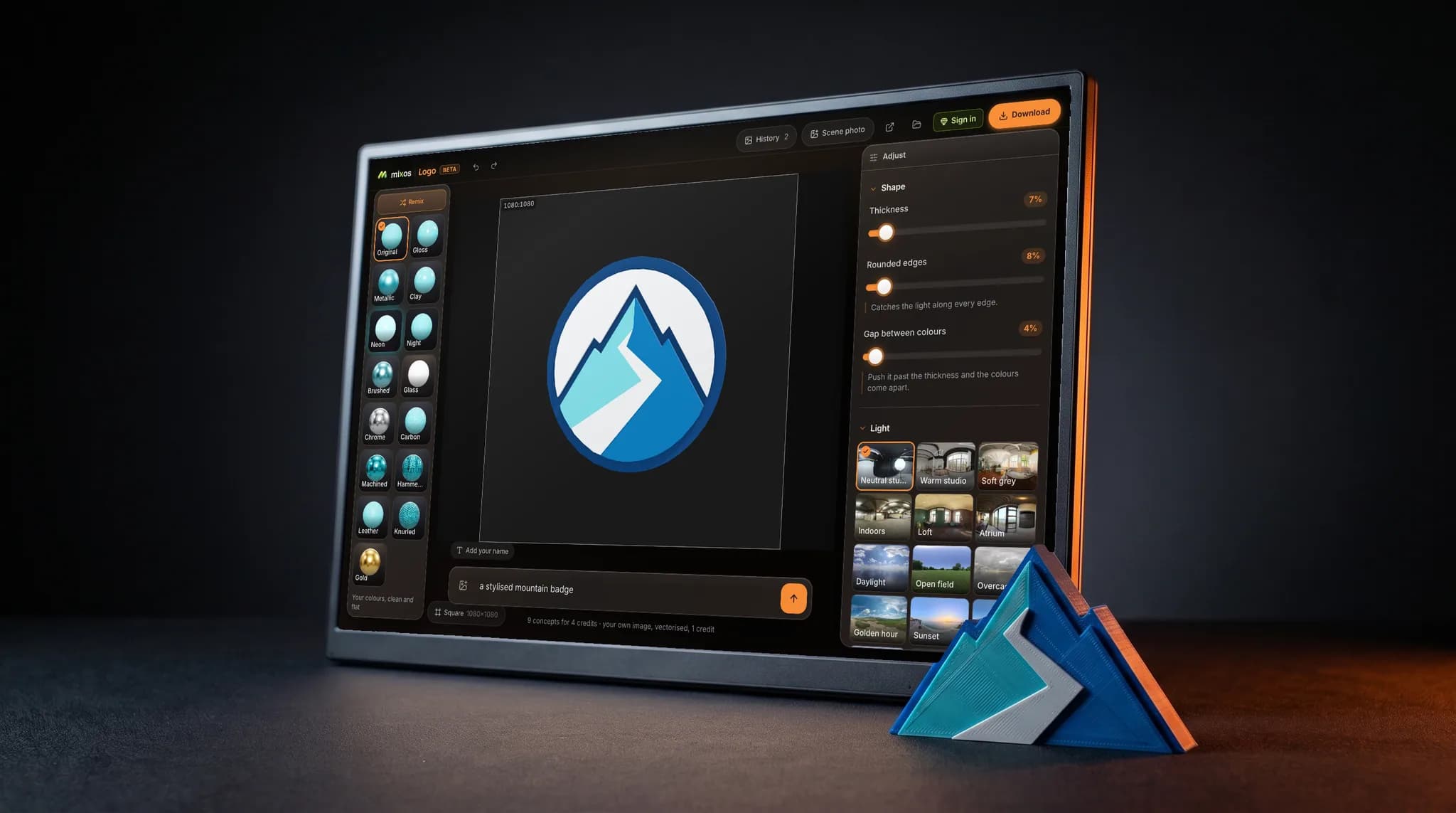
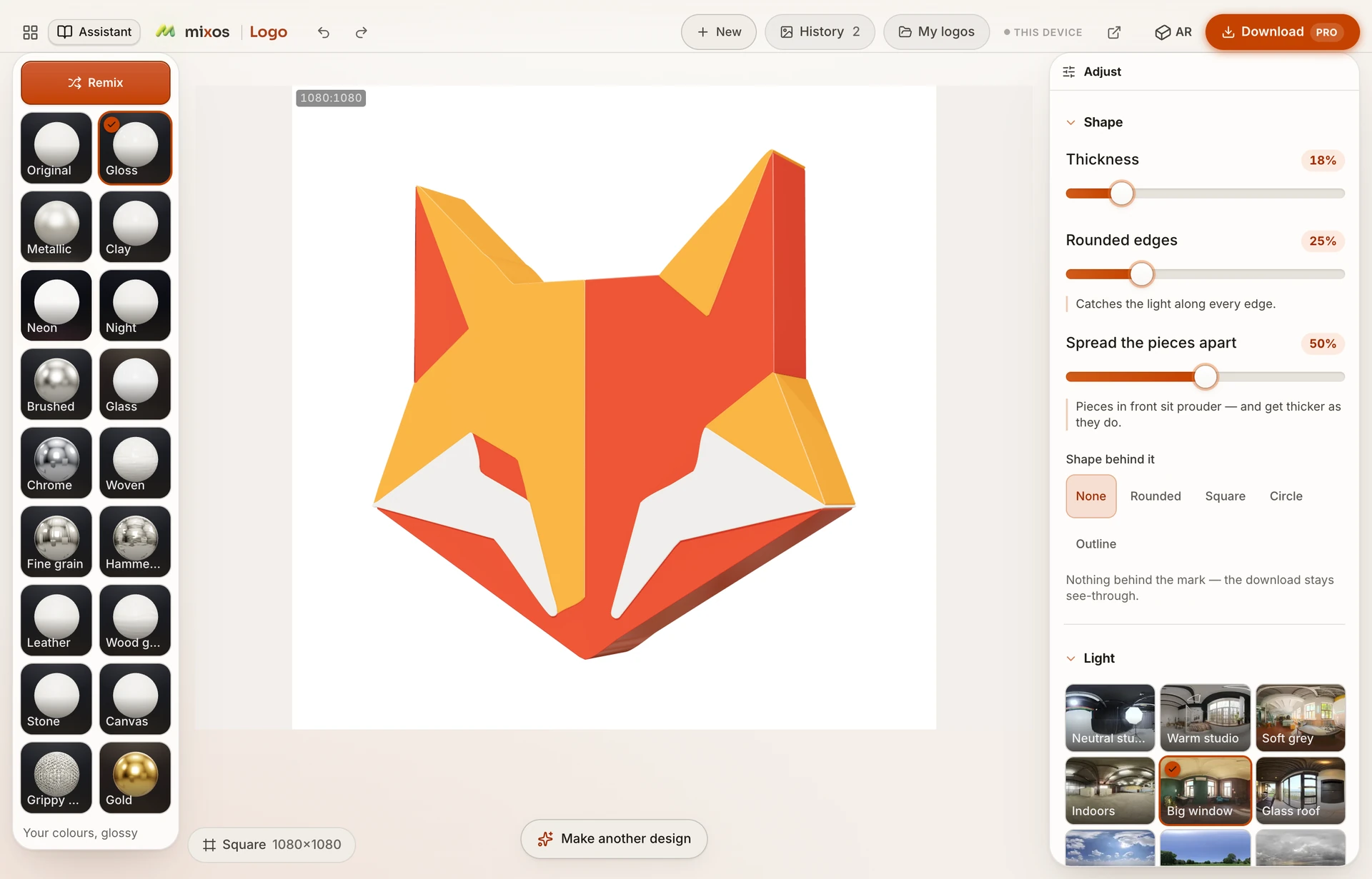
In practice, three settings do most of the work: thickness, rounded edges and the side-wall color. Push the thickness far enough that the edge is visible at whatever size the clip will play at — a logo spinning in the corner of a stream needs more depth than one filling a title card. Add a small bevel so the rims catch the light. Then pick a lighting environment with a clear key, because a flat, even light gives the rotation nothing to play with.
When it is set, Turn runs four seconds — round once, then a rest — and ends where it began. If a full revolution is more movement than you want, ten other motions sit beside it, from a quiet Breathe to a single Pop.