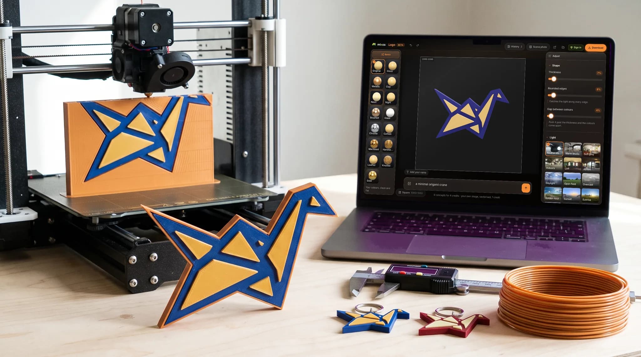
Most logos start life as flat artwork — a PNG from a designer, an SVG from a brand kit, or a mark somebody drew once and never got a source file for. An SVG opens free with a free account; a PNG or JPEG runs on AI and is a small paid step. If you have no mark at all yet, describe one and the AI logo maker draws nine concepts to choose between. Either way the result is flat, and flat is not printable on its own: a slicer needs a closed solid with real thickness, and a picture has neither.
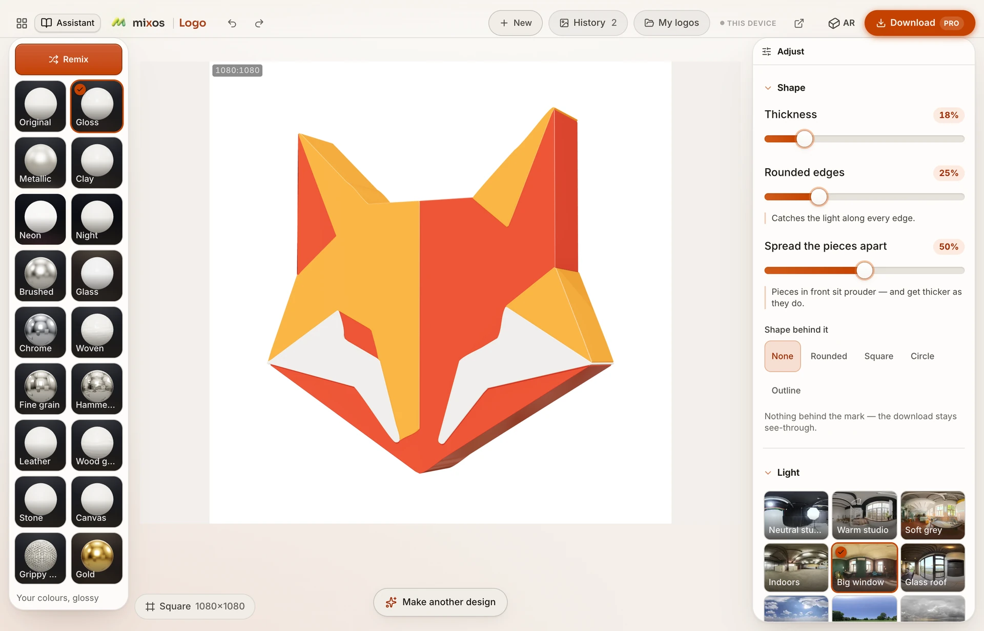
The usual route is to open a CAD package, redraw the outline by hand, and pull it up into a solid. That works, and it is a strange amount of software to install to put a shop name on a keyring. This does that part for you: the artwork is separated into flat color regions in the browser, each region becomes a closed shape, and each shape is given a thickness you set.
Because the colors are separated rather than flattened, a mark with several colors prints as an object with several raised pieces. A badge with a dark plate and a light emblem comes out as a plate with the emblem raised off it, which is what makes a printed logo read at arm's length — a single flat slab of the whole silhouette loses exactly that.
Artwork with a few solid colors and clean edges gives the cleanest result. A photograph or a heavy gradient is reduced to a small palette, so it comes back posterized into bands rather than keeping its shading — usable, but a logo drawn as flat shapes is what this is for.